- Wim Crouwel
- As one of the five founders of Total Design, a multi-disciplinary Dutch design studio, Wim Crouwel surfaced the concept of the ’Äútotal grid’Äů. Modular structuring and grids became the trademark of Total Design’Äôs work throughout the 60s and 70s, with a systematic approach to design projects. The studio introduced Crouwel to the realm of corporate design, including identities and trademarks, which demanded a need for original letterforms. Crouwel applied his grid theories to typeface design in early letterform experimentations in 1957. Beginning with simplified letters constructed from geometric segments, Crouwel developed a series of incomplete hand drawn letterforms.
- Four years later, Crouwel’Äôs previous series of letterforms expanded into the Neu Alphabet, an unconventional typeface that revolutionized type design. The letterforms were constructed using only horizontal and vertical lines creating an alphabet of all lowercase forms. Although only half of the letters are recognizable, Crouwel defends his intention to devise an alphabet based on a grid of squares. He states, ’ÄúI simply wanted to make a consistent alphabet on the basis of that grid of squares. I did not want any cluttering of vertical stems and did not find a solution within the conventional structure of the characters. So I began researching the past, looking for alternative signs with which I could replace the conventional forms. One could have made them up, but I wanted them to have some kind of footing in the history of type’Äů (Middendorp, 121). Reflective of his interest in new technology, the grid-based typeface was intended to be as ’Äúsystematic as possible,’Äů with the ability of consistent reproduction at all sizes on early typewriter devices.
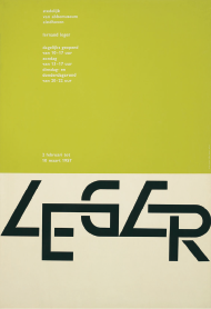
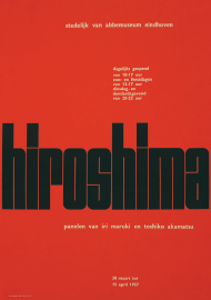
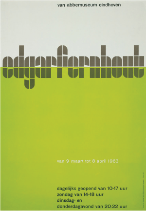
- Crouwel continued to experiment with grid-based letterforms as the designer for the majority of printed matter for the Stedelijk Museum. Crouwel’Äôs Vormgevers poster design is an ideal example of his geometric technique. With a visible underlying grid, the poster utilized a second grid-based typeface that evolved into the Stedelijk font. A third alphabet Crouwel developed, the Fodor Alphabet, was designed for the small Fodor Museum. Although the typeface is based off his original square format, the Fodor Alphabet breaks out of the 95 degree angled edges and incorporates rounded notches presenting a ’Äňfuturistic’Äô font that is used in the Fodor logotype. Crouwel continued to design several other typefaces, all exhibiting a logical extension of his persistently strong, underlying grid.