- Josef Muller-Brockmann
- The International Typographic Style revolutionized graphic design after World War II as Swiss designers began to experiment with typography and photomontage. Characterized by a rigid grid, structured layout, and unjustified type, the International Style reached a vast audience through these designers. Josef Muller-Brockmann, a leading pioneer of the Swiss Style, sought universal graphic expression through grid-based design. Founder and editor of the Zurich published journal Neue Grafik, Muller-Brockmann exposed the Swiss Style to America, allowing it to evolve into an international method of design.
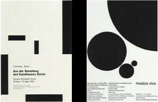
- Neue Grafik depicted Muller-Brockmann’Äôs geometric style through its utilization of a module, which is a small unit of space that integrates all parts of a page through repetition. Muller-Brockmann and his colleagues incorporated modular systems within complex publishing projects, exhibits and single-format posters. Like many post-World War II designers, Muller-Brockmann focused on producing work for cultural institutions and public information campaigns. His series of concert posters for the Zurich Tonhalle in 1951 demonstrate a definitive and geometric yet abstract style. The exhibition highlighted the his varied skills, including letterpress, silkscreen, and lithography, as well as his adaptation of concrete art; an abstract geometrical style that incorporates mathematical methods of spatial organization into graphic work to determine a visual equivalent for music. In 1955, Muller-Brockmann combines elements of the grid and the golden section in designing Beethoven, a poster that portrays Beethoven’Äôs music through a series of concentric curves. Beginning with pencil sketches, Muller-Brockmann developed his designs into geometrically controlled compositions where the typography was cautiously placed. These influential posters made a distinct contribution to the Swiss Style.